tableau tda-c01 practice test
Tableau Certified Data Analyst
Question 1
You have the following box plot that shows the distribution of average profits made in every state by
region.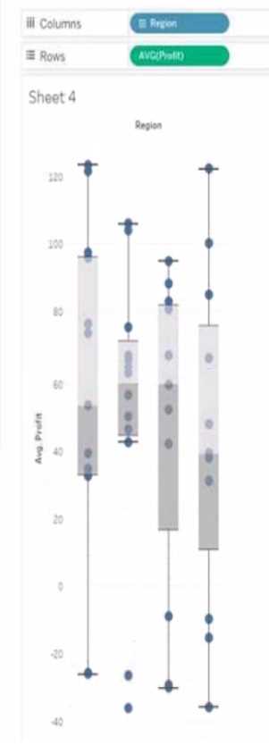
Which region has the smallest distribution of profits?
- A. South
- B. Cast
- C. Central
- D. West
Answer:
C
Explanation:
The central region has the smallest distribution of profits because it has the smallest interquartile
range (IQR), which is the distance between the first and third quartiles of the box plot. The IQR
measures the spread of the middle 50% of the data. The smaller the IQR, the less variation in the
data. Reference: https://help.tableau.com/current/pro/desktop/en-us/buildexamples_boxplot.htm
https://www.statisticshowto.com/probability-and-statistics/interquartile-range/
Question 2
HOTSPOT
You have the following dashboard.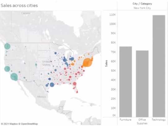
When a user selects a only on the map the data on the bar chart must show only the data for the
selected city. The data in the bar chart must change only when the user selects a different city How
should you configure the dashboard action? (Use the dropdowns in the Answers Area to select the
correct options.)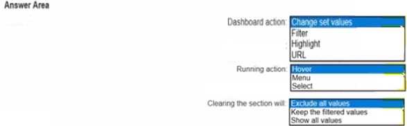
Answer:
Explanation:
To configure the dashboard action, you should select Filter as the action type, Select as the run action
on option, and All Fields as the target filters option. This will ensure that when a user selects a city on
the map, the bar chart will show only the data for the selected city based on all fields in common
between the two worksheets. The action will run only when the user selects a different city.
Reference: https://help.tableau.com/current/pro/desktop/en-us/actions.htm
https://help.tableau.com/current/pro/desktop/en-us/actions_filter.htm
Question 3
You have the following dashboard that contains two visualizations.
You want to show only visualization at time. Users must be able to switch between visualizations.
What should you me?
- A. A parameter and a calculated filed
- B. Worksheet actions
- C. Showhide buttons
- D. Dashboard actions
Answer:
A
Explanation:
Showhide buttons are a feature that allows you to show or hide a layout container on a dashboard.
You can use showhide buttons to create a toggle effect that switches between two visualizations. You
need to place each visualization in a separate layout container and then add a showhide button for
each container. You can customize the appearance and behavior of the buttons to suit your needs.
Reference: https://help.tableau.com/current/pro/desktop/en-
us/dashboards_organize_floating_layoutcontainers.htm
https://help.tableau.com/current/pro/desktop/en-us/dashboards_showhide.htm
Question 4
You publish a dashboard tut uses an attract. The extract refreshes every Monday at 10:00.
You need to ensure that the extract also refreshes on the last day of the month at 18:00.
What should you do?
- A. From Tableau Desktop, open the Publish Workbook dialog box and configure the schedule.
- B. From Tableau Server select the workbook select Refresh Extracts and then add a new extract refresh
- C. From Tableau Server. select Schedules find the schedule of the extract, and change the frequency to the Last day of the month
- D. From Tableau Server. select Schedules and change the priority of the existing schedule
Answer:
B
Explanation:
To refresh an extract on Tableau Server, you need to select the workbook, select Refresh Extracts, and
then add a new extract refresh. You can specify the frequency and time of the refresh, as well as any
custom options. You can have multiple extract refreshes for the same workbook with different
schedules. Reference: https://help.tableau.com/current/server/en-us/refresh_extracts.htm
https://help.tableau.com/current/server/en-us/refresh_extracts_add.htm
On Tableau Server, you can manage the scheduling of extract refreshes by selecting the specific
workbook and configuring additional refresh schedules as needed. This allows for multiple refresh
Question 5
A colleague provides you with access to a folder that contains the following files:
• Sates.csv
• Bookl.twb
• Sates.hyper
• Export.mdb
Which He contains an extract?
- A. Export mdb
- B. Book1.twb
- C. Sales.hyper
- D. Sales.csv
Answer:
C
Explanation:
A .hyper file is an extract file that contains a snapshot of data from a data source. It is a compressed
and optimized file format that can be used to improve the performance and portability of
dashboards and workbooks. A .twb file is a workbook file that contains the visualization and
connection information, but not the data itself. A .csv file is a comma-separated values file that
contains plain text data. A .mdb file is a Microsoft Access database file that contains tables, queries,
forms, and other objects. Reference: https://help.tableau.com/current/pro/desktop/en-
us/save_savework_packagedworkbooks.htm https://help.tableau.com/current/pro/desktop/en-
us/extracting_data.htm https://help.tableau.com/current/pro/desktop/en-us/examples_csv.htm
https://support.microsoft.com/en-us/office/introduction-to-access-database-files-9f9a0f8c-9a3c-
4a0b-8e6c-6d1f1f7c2b7e
Question 6
You have the following tiled dashboard that has one sheet.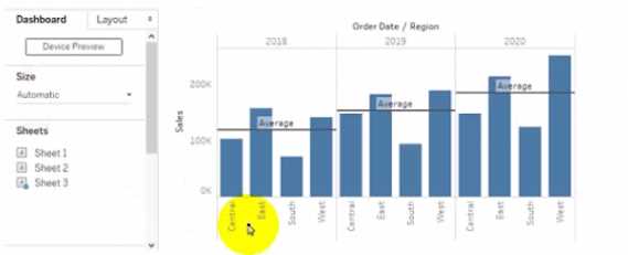
You want to replace fit sheet with Sheet2.
What should you do?
- A. Right-click Sheet2 and select Add to Dashboard.
- B. Select Sheets and click the Swap Sheet button next to Sheet2.
- C. From the context menu of Sheet3. select Remove Dashboard item
- D. Drag Sheet2 to the dashboard.
- E. From the context menu of Sheet3. select Deselect
Answer:
B
Explanation:
To replace a sheet on a tiled dashboard, you can simply drag the new sheet from the Sheets pane to
the dashboard and drop it over the existing sheet. This will replace the old sheet with the new one
and keep the same size and position. Alternatively, you can right-click on the old sheet and select
Replace Data Source, then choose the new sheet from the list. Reference:
https://help.tableau.com/current/pro/desktop/en-
us/dashboards_organize_floating_layoutcontainers.htm
https://help.tableau.com/current/pro/desktop/en-us/dashboards_replace_datasource.htm
Question 7
You have the following line chart that shows the average sales by month.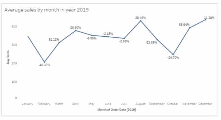
Which month had the biggest increase in swage sales compared to me previous month in 2019?
- A. August
- B. October
- C. December
- D. November
Answer:
B
Explanation:
To find the month that had the biggest increase in average sales compared to the previous month in
2019, you need to compare the slopes of the line segments between each pair of months. The
steeper the slope, the greater the increase. Based on the line chart, October had the steepest slope,
meaning it had the biggest increase in average sales compared to September in 2019. Reference:
https://help.tableau.com/current/pro/desktop/en-us/buildexamples_line.htm
https://www.mathsisfun.com/algebra/line-equation-slope.html
Question 8
You are the owner of an alert.
You receive an email notification that the alert was suspended
From where can you resume the suspended alert?
- A. The Data Source page of Tableau Desktop
- B. The Notification area of Tableau Prep
- C. The My Content area of Tableau web pages
- D. The Shared with Ma page
Answer:
C
Explanation:
To resume a suspended alert, you need to go to the My Content area of Tableau web pages, where
you can see all the alerts that you own or subscribe to. You can click on the alert name and then
select Resume from the menu. You can also edit or delete the alert from there. Reference:
https://help.tableau.com/current/pro/desktop/en-us/alerts.htm
https://help.tableau.com/current/pro/desktop/en-us/alerts_manage.htm
Question 9
HOTSPOT
You have the following dataset.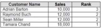
Yon need to calculate the ranking shown in the Rank field.
How should you complete the formula? (Use the dropdowns in the Answer Area to select the correct
options to complete the formula ?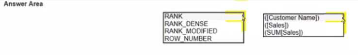
Answer:
Explanation:
To calculate the ranking shown in the Rank field, you need to use the RANK_UNIQUE function, which
returns the unique rank of each value in a partition. You need to specify the expression as
SUM([Sales]), which calculates the total sales for each product. You also need to specify the order as
descending, which means that the highest sales will have the lowest rank. Finally, you need to
specify the restart as every [Category], which means that the ranking will reset for each category.
Reference: https://help.tableau.com/current/pro/desktop/en-
us/functions_functions_tablecalculation.htm
https://help.tableau.com/current/pro/desktop/en-
us/calculations_calculatedfields_lod_rank.htm
Question 10
You have the Mowing dashboard.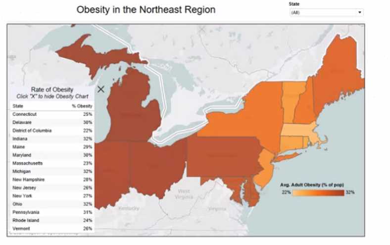
Which two elements are floating? Choose two.
- A. The state filter
- B. The color legend
- C. The map
- D. The Rate of Obesity chart
- E. The little
Answer:
BD
Explanation:
To identify which elements are floating on a dashboard, you can look for a gray border around them
when you select them. Alternatively, you can open the Layout pane and see which elements have a
pin icon next to them. The pin icon indicates that the element is floating and can be moved freely on
the dashboard. Based on these criteria, the state filter and the color legend are floating elements on
the dashboard. Reference: https://help.tableau.com/current/pro/desktop/en-
us/dashboards_organize_floating_layoutcontainers.htm
https://help.tableau.com/current/pro/desktop/en-us/dashboards_create_layouts.htm
Question 11
You have a database that includes field named sales, City and Region.
You have the following chart that shows the number of sales made in different cities.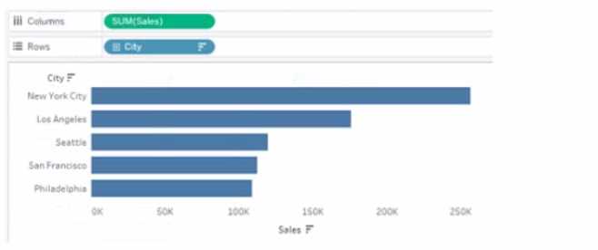
You want to dynamically show the corresponding region when users hover their mouse over any of
the bars.
What should you do?
- A. Right-click a in the chat, select Annotate and then select Mark.
- B. Right-click a bar in the chart select Mark Label and then select Always show.
- C. Edit the aliases for City.
- D. Drag Region to Tooltip on the Marks card
Answer:
D
Explanation:
To show the corresponding region when users hover their mouse over any of the bars, you need to
drag Region to Tooltip on the Marks card. This will add Region as a field in the tooltip text that
appears when users hover over a mark. You can also customize the tooltip text by editing it in the
Tooltip dialog box. Reference: https://help.tableau.com/current/pro/desktop/en-
us/buildmanual_shelves.htm
https://help.tableau.com/current/pro/desktop/en-
us/formatting_tooltips.htm
Question 12
You want to connect a Tableau workbook to a dataset in a Microsoft Excel spreadsheet.
What should you do from Tableau Desktop?
- A. From the Data menu select New Data Source
- B. From the Data menu select Replace Data Source
- C. From the File menu select Import Workbook
- D. From the File menu select New
Answer:
A
Explanation:
To connect a Tableau workbook to a dataset in a Microsoft Excel spreadsheet, you need to select New
Data Source from the Data menu. This will open the Connect pane, where you can choose Microsoft
Excel as your data source and browse for your spreadsheet file. You can then drag and drop your
sheets or tables to join or union them in the data source page. Reference:
https://help.tableau.com/current/pro/desktop/en-us/connect_basic.htm
https://help.tableau.com/current/pro/desktop/en-us/connect_excel.htm
Question 13
You plan to create a visualization that has a dual axis chart. The dual axis chart will contain a shape
chart and a line chart will use the same measure named Population on the axis.
You need to configure be shapes to be much larger than the line.
What should you do?
- A. Duplicate Population Drag the duplicate to the second Marks card and configure the see of the marks independently
- B. Create a custom shape that is larger than the default shape and add the shape to the Shapes folder in My Repository
- C. For the second axis select Shape on the Marks card From Select Shape Palette select Custom and then select Reset
- D. Change Population to a discrete dimension
Answer:
A
Explanation:
To configure the shapes to be much larger than the line, you need to duplicate Population and drag it
to the second Marks card. This will create a dual axis chart with two measures on one axis. You can
then select Shape on one Marks card and Line on another Marks card, and adjust the size of each
mark independently using the Size slider or menu. Reference:
https://help.tableau.com/current/pro/desktop/en-us/multiplemeasures_dualaxes.htm
https://help.tableau.com/current/pro/desktop/en-us/marks_markproperties_size.htm
Question 14
You have a dashboard that contains confidential information about patients health. The data needs
to always be up to date tor a team of healthcare workers How should you share me dashboard with
the healthcare workers?
- A. Publish the dashboard to Tableau Public
- B. Print the dashboard to PDF
- C. Publish aw dashboard to Tableau Server
- D. Export the dashboard as a .twbx
Answer:
C
Explanation:
To share a dashboard that contains confidential information about patients health and needs to
always be up to date for a team of healthcare workers, you should publish it to Tableau Server. This
will allow you to control who can access and interact with your dashboard, as well as schedule
automatic refreshes of your data source or extract. Publishing to Tableau Public would expose your
data to anyone on the internet, printing to PDF would not update your data, and exporting as a .twbx
would require sending a large file that might not be compatible with other versions of Tableau.
Reference: https://help.tableau.com/current/pro/desktop/en-us/publish_workbooks_share.htm
https://help.tableau.com/current/pro/desktop/en-us/publish_workbooks_tableauserver.htm
Question 15
You have the following dataset.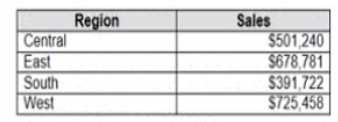
Which Level of Detail (LOD) expression should you use to calculate tie grand total of all the regions?
- A. {FIXED: [Region] SUM Sales}
- B. {FIXED: SUM Sales}
- C. {Fixed: [Region]: TOTAL Sales}
- D. {FIXED: TOTAL (Sales)}
Answer:
D
Explanation:
To calculate the grand total of all the regions, you need to use a Level of Detail (LOD) expression that
ignores any dimensions in the view and returns the total sum of sales. The FIXED keyword allows you
to specify the level of detail for the calculation, and the TOTAL function returns the sum of all values
in the expression. Therefore, the correct LOD expression is {FIXED: TOTAL (Sales)}. Reference:
https://help.tableau.com/current/pro/desktop/en-us/calculations_calculatedfields_lod.htm
https://help.tableau.com/current/pro/desktop/en-
us/functions_functions_tablecalculation.htm#TOTAL